9 tips for how to use color in UI design
Jul 3, 2018 • Jed Lehmann

Color is a vital part of any interface. It can determine personality, influence mood, signify actions, change visual hierarchy and even reflect cultural meaning.
When designing an interface, it's essential to treat color with the same attention that you give to other aspects of your interface such as copy, layout, imagery and typography.
Tip 1: Start with your brand colors

Codecademy's home page establishes two brand colors.
Brand colors are the colors used in the logo, typography, illustrations and other brand elements. These brand colors are a known-quantity, and therefore should be known from the outset of a software or website design project.
The brand colors should complement other colors in the interface, such as action colors.
Tip 2: Understand action colors

Stripe's home page uses green for the primary call-to-action. This contrasts against the blue of the brand.
Action colours are those that signify an element is interactive, or to notify the user of an action that has taken place.
Many beginner designers think they can only use brand colors in their interfaces. This can increase cognitive load for the user as they have to determine whether an element is blue because it's a branding element or if it's interactive.
Action colors may be used on various interface elements:
- Call-to-actions for users to take
- Buttons and links
- Tabs and sliders and other interactive elements
- Notifications, alert messages
Using action colors for interactive elements can help distinguish page content from page actions. Action colors increase the understanding and usability of an interface.
Tip 3: Learn some color psychology

Yellow suggests happiness, like a field of flowers perhaps?
Color psychology is a branch of psychology that studies the influence of color on human mood and behavior. Colors speak to human emotions, so you should be aware of the emotional effect of the colors you use.
- Red: Passion, strength, energy
- Green: Nature, growth
- Blue: Calmness, peace, innovation, safety
- Yellow: Happiness, enthusiasm
Tip 4: Understand the features of a color
Understanding the features of a color gives you the ability to nail down exactly which part of a color might need adjustment.
- Hue: The variety of the color, e.g. red, blue
- Saturation: A measure of the strength of the hue
- Lightness: How light or dark the color is
- Tint: A lighter version of the color
- Shade: A darker version of the color
Tip 4: Be aware of color theory
You probably remember color wheels from school. Sir Isaac Newton developed the first circular diagram of colors in 1666, and since then many variations have been created.
- Analogous: Analogous colors sit next to one another on the color wheel, e.g. red, orange and yellow
- Complementary: Complementary colors are opposites on the color wheel, e.g. red and green
- Triadic: Triadic colors are evenly spaced around the color wheel
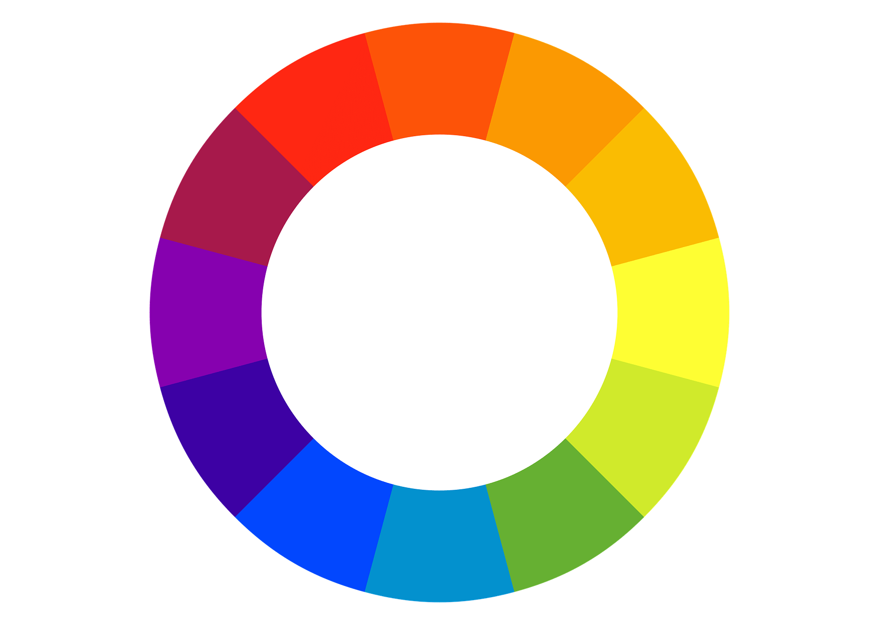
Basing a color palette on a color theory can give you a starting point for a palette, but most likely won't give you all the answers.
Tip 5: Use real-world metaphors
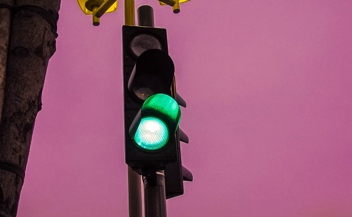
You're good to go.
Traffic lights use color to signify action. Green signifies go, that everything is OK to proceed. Orange is a warning, and red means you'd better stop right now.
These colors are almost universally recognized. Interface design should mirror expectations. This means using people's expectation of color to reduce their learning curve of an interface.
Tip 6: Select action colors with brand, color psychology and real-world metaphors in mind
Actions in interfaces are sometimes categorised into the result of the action that is about to be taken, or has been taken by the user or the system.
Errors
Red is regularly used in interfaces to signal an error or an action that may delete something that cannot be restored.
Success
Like the traffic lights, green is often used in interfaces to communicate success or encouragement.
Warnings
Orange can be a good choice for an action that may have consequences, but perhaps not as critial as an error.
Primary actions

A primary action on a page might be a button you expect the user to click on in the vast majority of cases. This primary action might be a strong brand color, or perhaps another color. This color should command attention and avoid confusing the meaning conveyed by the other action colors.
Secondary actions

Perhaps you need a neutral style for secondary actions. This doesn't have to be its own color, but a neutral color can work well for secondary actions which shouldn't command lots of attention.
Tip 7: Use neutrals to provide a quiet backdrop
Neutral colors are used in interior design to provide a quiet backdrop where strong colors can thrive.

The red sofa draws the eye.
The sofa is the focal point of this living room due to its strong color. If the walls were the same red as the sofa, the sofa wouldn't command the same attention and the room would be overwhelming.
Having a palette of neutrals is useful to give an interface a grounding where the focal points, normally the action elements, can thrive.
By the way, neutrals don't always have to be grey – add a little blue for a cool touch, or orange for a warmer hue.
Tip 8: Provide suitable contrast for accessibility and readability
Text should have adequate color contrast for accessibility and readability reasons. WCAG 2.0 has three conformance levels: A (minimal), AA (mid-range), and AAA (highest). AA is considered the industry standard. The AA standard for color contrast is a 4.5:1 ratio between foreground text and background color.
The Contrast Ratio tool can be used to calculate the contrast ratio of a text color against a background color.
Tip 9: Use online tools for generating color palettes
Color palette generators are great for experimenting with color palettes. You can also find inspiration in color palette galleries such as Color Lovers.
1. Coolors

The super fast color schemes generator.
2. Paletton
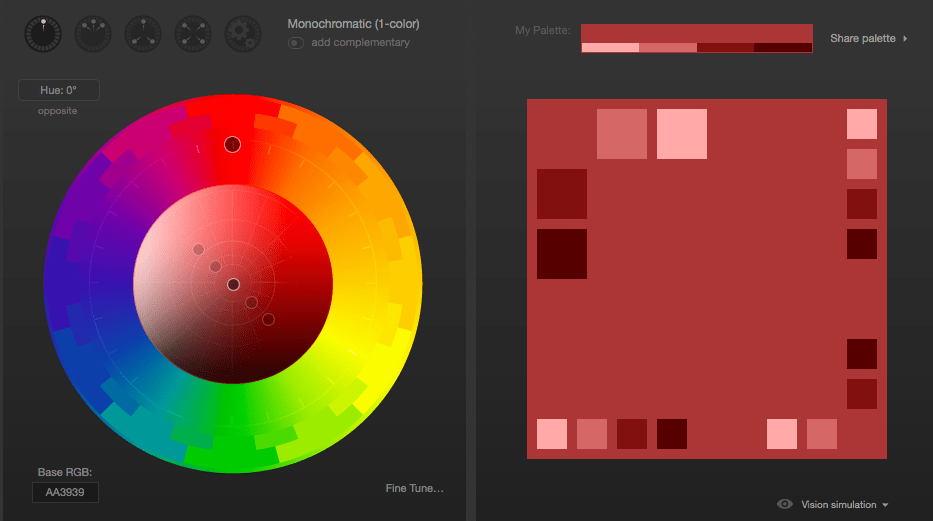
The color scheme designer.
3. Check my Colors
A tool for checking foreground and background color combinations of all DOM elements and determining if they provide sufficient contrast when viewed by someone having color deficits.